Thursday, 21 May 2015

19. My trailer evaluation

I will evaluate my trailer in sections so that I don’t overlap myself.

Starting with the story it portrays I feel I was able to cut and rearrange scenes effectively and that the full minute playback makes sense and follows easily. In the making of this I was able to simply mark in and out the parts of a long video that I wanted to utilise and then cut any discrepancies down with the razor tool on the time line. The razor tool was really efficient for removing extras or splitting scenes so that individual points could be altered without it effecting the entire section. This is a technique that I used for the backing track so that I could alter the volume levels differently depending on what was playing at the same time as the music. The piece on a whole plays smoothly I feel and is fairly seamless with the exception of one or two places. As I mentioned in my first trailer write up, I used transitions tactically in some places to remove any jars in the flow of the video. For example, I used a dip to black in between the scenes of Gandalf and Saruman talking and Saruman sitting because it really didn’t fit well at all; I used this transition in particular to emphasize the movement Saruman makes in front of the camera and the dissolve effects didn’t execute this as well as Dip to black did. 

I believe that I used the appropriate transitions and in the appropriate places. I didn’t want to be overbearing with the use of transitions or effects as I don’t believe quantity makes the quality necessarily better. 

I’m happy that I took the time to split the backing track as I mentioned before instead of having one continuous volume all the way through the trailer. I wanted to be able to change the focal points aurally to convey the atmosphere or the dialect that was occurring at that moment of viewing. I sparsely used transitions/effects on the audio track, mainly because I think I achieved what I wanted before adding these in, however the gradient audio transition does remove some of the staccato volume changes. 

I had some trouble with changing resolution and I did not alter the frame rates whatsoever. I mentioned in my trailer blog post that I did not use tools or methods that I learned, such as using a still image to make a moving piece and I know that from this I have lacked to show skills and techniques that I absolutely should have incorporated. Another issue I faced was with the title page image at the very end of the trailer. I made this in Photoshop, but did not set any specific dimensions to it. As a result of this the image was completely enlarged and out of focus when I imported it into Premiere. I had to re-edit this image multiple times, but this has ended being a stretched image instead of one with the correct dimensions. 

To look at the piece as a whole, including the methods I used to achieve it, I know that I could have done much better, but to not be overly critical I am still pleased with the outcome. I stuck to the research I had carried out to keep a theme and atmosphere that correlated with the fantasy genre and if I was to make a comparison I believe that I could pin point similarities in the order and general feel of the information it gives out. 

18. My production company logo evaluation

To summarise and shortly evaluate my production company logo I’ll begin with the tools I used for this part of the module. I used a range of tools in Illustrator to create the image that I have such as the pen tool, the paintbrush tool, fill, framing and anchor selection. 

I had the aid of a graphics tablet for this part of the module, this really helped with the initial outline and the filling in and shading of the tornado. The narrow ended, precise selection helped with using anchor points tenfold and I found it much easier to manipulate the shapes I had created. 

I left this image without backing, frame or text in front of it for a long period of time and I’m still not completely happy with this part as it is. The frame could have potentially been an oval shape, filled with a less abrasive colour; this could have left the text just overlapping the sides slightly instead of everything just sitting in a box. I feel that my logo looks unprofessional now that it is a ‘completed’ section. 

Although I managed to utilise tools successfully, I could have created more complex shapes or have created the tornado using different methods that would have fit the module criteria. I treated this part of the module with far less importance than the three ‘main’ sectors and this affected my work negatively. Next time I would allow more time to focus on parts of the ‘same’ value and orchestrate my working hours for efficiently. 

17. My Disk cover evaluation

To evaluate my disk cover I will first focus on the image I chose to use; I chose this image because it related to something in the trailer, but didn’t feature on the cover. It aesthetically works very well with the placement I have chosen. I layered over a texture to tie in with the worn down atmosphere that I conveyed on the front cover. I didn’t make the same mistake of using dark font and it is much clearer and professional looking as a result. 

A major downfall here is that I was unsure of how to correctly set up the guides so I used a template to achieve the dimensions and this didn’t translate correctly when I printed. The disk cover also loses it’s DVD logo when printed, this is something that I should have corrected. 

I learned about inverse selections and how to remove around the layer you were focused on by using a template, but I believe I used the worst method and I should have tried to find better resources for help in this. Next time I would print out the image more in advance of submission.

Overall I am pleased with the disk cover I created, I believe I used the correct tools for the tasks I put them to and that I was able to cover most of the basics that were set out in the module. 

16. My DVD cover evaluation

I’ll break my cover down into sections to evaluate it.

Starting with the front cover; I’m really happy with the image that I chose for this part. Initially I left it without a filtered texture on top, but I think I made the right decision in putting it on. The pattern it leaves makes the sky atmospheric, but doesn’t seem to affect the building and I think this makes it really leap off of the cover. If I was to reattempt this again I would try to lighten the very top or set the font as white. In hindsight using white font would have tied in with the font on the back cover as well as the disk cover. The title draws away from the authenticity of the rest of the image. I can liken this to a professional level DVD cover and agree that my end result doesn’t look heavily edited or messy in comparison. Although I did not utilise many tools in the making of the this section I think I selected the appropriate effects to achieve my goal for the front cover.  

The spine doesn’t have much complexity to it; I used an image of rust, stretched out to get the color gradient here. I used the text tool for the lettering here, instead of importing the image with the text on already. I’ve copied in some cut out logos; I used the magnetic lasso for snapping to the shapes, so I think I used the quickest tool available for the task. When I first printed the cover I had set the guides up incorrectly and it was far too small, I managed to rectify this really easily by readjusting the guides.

Lastly the back cover; I’m not greatly pleased with the outcome of the back cover. There are aspects of the overall page that I am pleased with, for instance the border around the synopsis. I’m pleased that I elected to make a full one with 4 corner images, I think without creating a full frame in Illustrator it would be impossible to get a tidy result. However, I am unhappy with the way the stills sit on the page, they look unnatural. I tried to rectify the top 3 slightly by lowering the opacity of the middle one, I believe this helps, but overall I could have researched into how to set images down better. 

Overall I can comfortably say that I kept a fair likeness to the types of DVD cover I was trying to ‘fit in’ with, with my cover. I’ve used a variation of tools to create something that covers the basis of the module set out. There is definitely more that could have been done and more utilities and techniques that I could have applied in this. 

Wednesday, 20 May 2015

15. How the trailer plays

Again, as my plot changed during this module I'd like to just make a small outline of what my trailer should play out with some screenshot of the trailer when it is playing.

The trailer will started with a subdued flash of the Tolkien logo, this immediately links it to an already existing franchise.


This has a dip to black effect at the end which then melds into a scene with Saruman. I've arranged clips from the Hobbit in a backwards order so that it seems as though Saruman is raising Sauron instead of banishing him.


This process covers almost a third of the 1 minute duration we were set for the trailer. Following this I have selected to use some Dialect between Gandalf and Saruman, this explains the story that the film would theoretically follow.


This is one of the places where I had to tactically use a dip to black to make the scenes fit in a more professional manner. At the end of this dialect sequence I used a dip to black again, but this time for dramatic effect. I wanted the speech at the very end to tail off and using this transition definitely helped achieve the result I wanted. Straight after this dialect ends the scene changes into the main villains of the trailer, it shows them riding out followed by their leader donning his garb. 


It will end with a short sequence of one of the Ringwraiths turning round to the viewer. Again for dramatic effect I cut the backing track at this point so that the final line could be heard clearly with no distraction. 

The trailer ends on a Title page as they typically do. 
I struggled to get the dimensions completely correct for this and had to re-edit this multiple times in Photoshop so that it would fit the widescreen. 


This is the title page for the very end of the trailer, as you can see it has become stretched from excessive editing, but it does fully show on the screen with the dimensions set in premiere. 


.

14. My Trailer

Unfortunately I had to change from my original idea to use original filming and collaborate that with existing film footage to create the plot idea that I had settled on.

I altered my plan so that I could use solely existing film footage from the Lord of the Rings films and the Hobbit films. I have been able to cut parts of scenes from these trilogys to make a different story for my trailer. I have not been able to showcase any skills that relate to using my own footage, for instance changing the temperatures on clips so that they match the tone and lighting of the existing footage I used.

I have been able to use a variation of skills and tools that are available within Premiere to create this trailer. For starters I arranged my project space with appropriately named bins. I wanted to ensure that all of the fragments that made up the trailer could be easily found.


Import Space

Import Space expanded
Once I had imported the files that I wished to use I worked through them systematically and cut sections from the sequences that I moved over to the timeline. I used the mark in and mark out tools for this function.

As some of the clips have come from different parts of different films I have tactically used transitions such as cross dissolve, non-additive dissolve and dip to black to disguise any minor discrepancies in the footage that I linked together. In a number of places the resolution differs, but unfortunately this is something that I have not been able to rectify. 

My finished timeline
This is the result of my finished timeline. I have the sequences and images running along the first Video line and their own audio attachments below. The last audio line is a backing track that I have added. I used the Razor tool to snip down the audio even though it has not been rearranged, this is so that I could adjust the audio controls for each of the sections. I didn't want the music to overpower any dialect in the trailer, but I did want it to be the main aural piece for every thing else. I have added in some gradient fades to the starts and ends of the audio in some places so that the change in volume is not so drastic. I also reduced the sequences' audio is most places apart from the dialect which I raised to full volume. The module guide laid out that the trailer must not exceed a 1 minute duration and this I managed to successfully achieve; my trailer ends at exactly one minute long.

There are skills that I have that I have not been able to showcase in the trailer that I made such as giving the effect of a still image moving, but I didn't see opportunity in what I wanted to create. 

Monday, 18 May 2015

13. My Disk Cover

I have designed a disk cover to accompany the DVD insert.

This has been made solely in Photoshop using a range of techniques. I first found the image that I wanted to use for the main background cover (below) and set the image size to 1370 pixels. I've used 1370 pixels as the measurement as that is the number that correlates with DPI of 300 and the size of a standard disk cover.


The next step I took was to duplicate a disk cover template into the image I selected for my cover. The template is a 116 millimeter circle with a 23 millimeter hole. I arranged this so that it was covering the part of the image that I wanted displayed on my disk and set the opacity to 20%. I inserted some text in the themed font I have chosen and duplicated in the logos for the rating, DVD and my production company logo. 

For a finishing touch I wanted to add a scratched effect to the main image; I decided on using this image (below) to filter over the whole cover. 


This has opacity set at 34% and I have used the filter Hard Light to obtain the desired result.
I've hidden the layer that contains the disk guide instead of removing it so that this can be shown upon checking the project. 

This is the finished result;

Overall I am pleased with the outcome of this section of the project. I feel the layering effects that I have used work really well with the image that I chose and the decision to color the text white makes the whole piece very aesthetically striking. 

12. Checking measurements

As a matter of necessity I have tried my DVD case insert in a standard DVD case. As shown the spine dimensions are far too narrow and this is affecting the text and images placed there.

I have shifted the front cover image across and widened the spine guide lines to accommodate these changes, I've also rearranged everything on the spine so that it sits more centrally. 

The bleed and trim lines have left the perfect amount to be removed from the cover so that it slots into the case perfectly.  

Sunday, 17 May 2015

11. My finished cover, some details.

For making this cover I have used a variety of the softwares' tools and techniques. I wanted to, in this post, pin point some of the areas and what tools where used in that particular part.


This is what the project looks like in Photoshop, I have set up guides for the trim and bleed. The trim lines are what are shown in blue, marking the sections of the case: for the bleed I added 3 millimeters round each side, this is the part outside of the blue guide lines. 

As I have used so many different components it is important that I have used verbose labels for each section, this way a particular section can be selected with ease. 


This is a shot of one part of the layers area. From the labels and the thumbnail images it is clear and simple what part is what, it is imperative for ease of access and quick editing that anything made with a build up of layers is labelled like this. 


For the middle image I have lowered the opacity to 75%. I really didn't like the rigid look that had been created by all of these images being placed together and I wanted to break that up slightly. I had initially planned to border each of the images, but better judgement deemed that it would look far too noisy and unprofessional. These are all stills that relate to the content within the trailer that this accompanies, which is something that correlates with existing DVD covers within this genre. 

I have referred to my initial research at every point and have continued this as the project has moved along. Comparatively speaking, I can pick similarities in my cover and existing ones that I have tried to use the same methods as. 


As previously stated, I added the white text as an aesthetic more than anything else, but I made sure to add the commonplace logos found on a DVD cover. I noticed that the age rating is seen on all sides and made sure to incorporate this. The Tolkien logo was added as a point of consistency, as this is a theoretical piece, theoretically it has an audience that needs to be drawn in and showing a known 'franchise' logo is part of that method. 


On the cover I have added an image of flaking, painted wood. The opacity of this layer has been set to 44% and set with the Soft Light layer effect. I've used this filter as it really leaves a lasting effect on the sky, but not the architecture in the image which was the result I wanted. This is to aid the depiction of a bleak or apocalyptic world.  


I have mainly used tools such as the magnetic lasso tool, crop, move and text (vertical and horizontal) within this, the need to use any spot/patch healing has not arisen since my practice pieces. 


10. Finished DVD insert design


I have now moved forward on my DVD case insert from the mock-up that I made. I have stuck to the design that I had in mind, but have enhanced this and used existing DVD covers for inspiration and to compare the level of professionalism. 

This is my finished DVD insert:


As I have followed a Tolkien inspired theme I have used the font that features in other films made of his work. This font, called Ringbearer, was sourced from DaFont*: it is striking and unusual, which was a point that I made at the stage of doing research into the Fantasy theme. The font has been imported so that I have been able to use the Text utility instead of inserting an image of the text into the project.

I have used an image of Barad-Dûr for the cover, this is not an action shot as so many fantasy covers do have, but it is very atmospheric and I feel that comparatively it works to pull focus just as well. 

The back cover comprises of the most parts: The main image is linked to the title, just as the cover image is, and this has been layered over with movie stills. I have only used images that relate to the story conveyed in the trailer for this piece. All of the footage and images have come from already existing Tolkien films, such as The Lord of the Rings trilogy and The Hobbit trilogy. 

The synopsis, which has been written in the same fashion as is consistent with other films within the Fantasy genre; has been framed in a corner piece that I have repeated and rotated to fit. 

All of the images used within this piece have been cut or cropped within Photoshop and then duplicated into this project. I've found the magnetic selection tool extremely useful for cutting out shapes or images that are more complex than and standard shape, this tool has been used for all of the little additions like the DVD symbol, rating symbol and the small Tolkien logos. 

The last finishing touches that I have added are the sections of white writing for the film review (top) and the film information (bottom right), although these aren't necessary and do not show a particular skill they do add to the overall look. 

I will go into more detail about the techniques and tools used in a more specific post where I can show particular segments of my work. 

*Font source here - http://www.dafont.com/ringbearer.font

Saturday, 16 May 2015

9. My Finished Production Company Logo

I have now finished my logo for the production company that the final piece would theoretically be filmed under.


The entirety of this image has been made within Illustrator. As per my previous post the tornado/whirlwind was an interpretation of an image I found through Google, hand drawn and filled using the paintbrush tool. The initial outline and the inner shading shapes were created with the aid of a graphics tablet. This helped really utilise some of Illustrators functions, such as the paintbrush, pen, pencil tools: it also made using and moving anchor points very smooth and controlled. 

The image shown above will feature on my DVD Case insert and the disc cover as well. 

Tuesday, 12 May 2015

8. My DVD Case Insert Mock-up.

I have made a physical mock-up of the DVD case insert that I plan to make in Photoshop and Illustrator.

The final piece will be called Barad-Dûr; The Final Episode. The plot of the trailer has now changed from the last idea which I included in my blog posts and is now an amalgamation of already existing film footage from The Lord of the Rings and The Hobbit,

The original of this mock-up will be included in the physical copy of this blog.


In this I have incorporated the font that I wish to use, this is a font that adheres to my previous research and correlates with the topic and plot I have chosen.

The background of the overall insert will be different, there will be no white showing, but I wanted to use this as a starting point.

The back comprises of a synopsis, that will be extended on the final piece and some images that will link and relate to the trailer.

Thursday, 26 February 2015

7. My Production Company Logo

My next task was to create the logo that will accompany the box that I produce in the end.

I used the image above for inspiration for my company logo. I'm going to call the company WhyrlWynd so a tornado is the ideal image for this. The logo will be a small emblem on the DVD case and the disc itself.


This is the logo that I have drawn in Illustrator CC, I will add text to the image, so that I can make use of other skills that I have learnt. This image has been hand drawn using the paintbrush and pencil tool. I tidied up the shape and lines by adjusting the anchors and handles. 

I will add text to the front of the image next.

Tuesday, 24 February 2015

6. My chosen genre and plot

I have chosen Fantasy for my genre and will be using the Lord of the Rings plot for my trailer. 

The trailer will show two or more people playing the Lord of the Rings board game, when one of the players lands in a game area (Mordor, Rivendell etc) the board transports them to that area. The house shakes as if there is an earthquake, the players go to the front door and see that they have entered another realm. The general plot is that they have to finish the game to get home. 

This idea gives me a good opportunity to use original filming and existing footage used in the Lord of the Rings and the Hobbit franchise to showcase any skills and techniques for video editing. 

This is my updated and extended mind map. This is more specific to the piece that I was make, whereas before I have brainstormed very generically. 


I now need to plan out my box cover and my 'production company' logo.

Sunday, 22 February 2015

5. Brainstorming

Before I can move onto using Premiere and Illustrator I have come up with some ideas for my trailer.

So far I have one for Horror and two for Fantasy;

Horror

1 - Using a derelict church and dark shots, give the illusion of being followed/chased. Fill the trailer with suspense, but give nothing away as to what is chasing the protagonist. This will increase the feeling of dread. The box synopsis will need to explain and correlate with the trailer for it to wholly make sense. Likely to use only original filming.

Fantasy

1 - Using original filming and film clips to create a trailer that shows our realm being attacked and under threat from the Deatheaters and Voldemort. This will need to have original filming, filmed to match the style of the films that I would use clips from.

2 - Using original filming, capture two people playing a Lord of the Rings board game. The trailer will show them (two+ people) mid game, jumping into one of the game areas on the board. When the player lands in the game area the house (and camera) shake, as if there is an earthquake happening. The players go to check outside the house and find that they have been transported to the game area they had just landed in. (Jumanji-esque) I would need to combine original filming with film shots and clips from the LoTR films.


Currently, I am drawn towards the last idea as I already have many of the props I would need to make the trailer ready from digital editing. It also has the most opportunity for using both video editing, cutting and re-arranging and original filming for editing.

I have also made some small mind maps to help me with my ideas;


These are comprised of common features in the genres and could be things that I could incorporate into my trailer.


Monday, 16 February 2015

4. Another Idea Picture

I have created another practice piece to cover the fantasy genre as I am still undecided on which to choose for the final piece I will create.

As with the horror picture I created the effects are evident, though I feel that there is progress shown in this one already from the last piece.

I started by comparing the landscapes generically used in fantasy covers and decided upon using a castle.

This is the original picture:

I picked this because I thought the sky and the placement of the castle was ideal to make that the focus of the image. Firstly I removed all of the ducks. Ducks are great, but I don't think there would have been so many lazing around in the middle of a medieval scene. I used the patch tool and the healing tool for removing the bulk of them and then the spot healing brush to smooth out the edges. 

I also tidied up the path, removing the puddles and the gravel from the grass banks. I added banners to the castle turrets and a flag to the upper middle section. I found this difficult as they looked obviously super-imposed, I tried to ease this look by adding an effect to them. The luminosity type worked the best and this is what they were left at. I had to create the flag pole from three separate photos as the original image didn't match the images consistency. I had to choose where to put the layers so that parts of the images I had used sat behind the flag itself. 

Lastly I added a knight in the front and centre of the image and covered the image with a sunburst effect. This is a consistent factor in fantasy images, I changed the opacity of the effect and used the overlay 'filter'. 

This is the edited image with the sunburst and then without:


I have shown this without the sunburst so that the retouching made on the grass and water can be seen easier. The knight in the front of the image does look super-imposed and I feel in this piece that has been my biggest place for improvement. 

Tuesday, 10 February 2015

3.Initial Practice

For an early practice piece I have gone over my current skill set to create an image that relates to the one of the genres I have chosen for my final piece.

The effects are fairly evident, but I feel this will just showcase my progress better.

I took a picture of a church from the internet; I tidied up the grass and headstones using the spot heal brush and used the content-aware patch tool to remove two headstones from the front.
I then added a plastered wall texture over the image which created a mottled effect on the sky, giving the illusion of scattered clouds. This layer used the soft light effect.
I then added a dark image of a ghost which I cut down using the lasso tool, I then shrank the image, placed it and changed the opacity to 54%. To cover some of the ghost I took one of the headstones I originally removed and layered it over the lower half of the ghost. Lastly I added a cracked paper effect over the top of the whole image using the darken layer type.

This is the original image;

This is the edited image;


The effect is as though it is a weathered and crumpled photo. As I previously said the editing is obvious and it gives me a good starting point. 

I have used techniques in the making of this that correlate with techniques used for horror, making the image darker and unnerving. Next I will try to use my current skill set to adapt an image to match that of one used for Fantasy! 


Monday, 9 February 2015

2.So the Story Begins.


I've decided to go with a film for this module instead of a game, but so far I am struggling to decide between genres. I am leaning towards Horror at the moment with the other option being Epic/Fantasy.

I've made some initial comparisons so that I can later brainstorm and draw up possible box covers.

Immediately it is evident that a use of dark colours is atmospheric for this genre. The title text in all of these examples is bold and striking, using an unconventional font. There is no pattern to the images displayed on the covers, they need to correlate with the plot, but they are all visually unnerving. In other examples I have seen any shots of the characters shown on the covers will pull focus with facial expressions rather than using action shots.
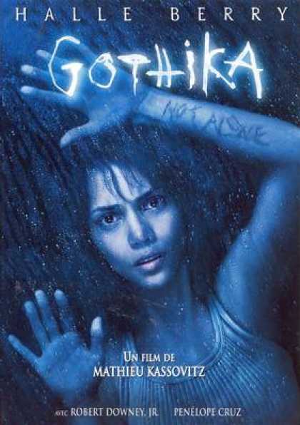
All of the facial expressions shown in these examples can fill the viewer with a sense of dread, they are powerfully emotive and this will be something I need to take into account if I am to pursue horror for my final piece.

Epic/Fantasy seems to be an almost polar opposite with the techniques used on the covers.


General consensus is that action shots are used quite heavily in these covers. While the colour schemes are not dissimilar to those of Horror I would label them bleak rather than dark. Realism is used heavily in fantasy as this creates the illusion of it being real and thus enveloping the viewer,
I would call the use of striking and unusual font out as the same in both of these genres. They are both leading you into worlds and situations that are unlikely, if not impossible to happen in real life and I think a new or artistic font can portray this well.
It seems common practice to show the actors on the covers as well, unlike horror where the image just needs to give a feeling of unease, there is no need to push for that character connection.

My next step is going to be to brainstorm some film ideas, I will start with two from each genre and work towards the basic theme for each and atmospheres I would need to create for each idea with the skills I've learned.

1.Watch this Space!

Primarily I am going to be using this blog space to log my ideas and progress for the module I am currently working on.
This will become my creative haven, to be filled with brainstorms, mock-ups and instructions.
I hope to share with you the journey from idea to physical form.