Thursday, 26 February 2015

7. My Production Company Logo

My next task was to create the logo that will accompany the box that I produce in the end.

I used the image above for inspiration for my company logo. I'm going to call the company WhyrlWynd so a tornado is the ideal image for this. The logo will be a small emblem on the DVD case and the disc itself.


This is the logo that I have drawn in Illustrator CC, I will add text to the image, so that I can make use of other skills that I have learnt. This image has been hand drawn using the paintbrush and pencil tool. I tidied up the shape and lines by adjusting the anchors and handles. 

I will add text to the front of the image next.

Tuesday, 24 February 2015

6. My chosen genre and plot

I have chosen Fantasy for my genre and will be using the Lord of the Rings plot for my trailer. 

The trailer will show two or more people playing the Lord of the Rings board game, when one of the players lands in a game area (Mordor, Rivendell etc) the board transports them to that area. The house shakes as if there is an earthquake, the players go to the front door and see that they have entered another realm. The general plot is that they have to finish the game to get home. 

This idea gives me a good opportunity to use original filming and existing footage used in the Lord of the Rings and the Hobbit franchise to showcase any skills and techniques for video editing. 

This is my updated and extended mind map. This is more specific to the piece that I was make, whereas before I have brainstormed very generically. 


I now need to plan out my box cover and my 'production company' logo.

Sunday, 22 February 2015

5. Brainstorming

Before I can move onto using Premiere and Illustrator I have come up with some ideas for my trailer.

So far I have one for Horror and two for Fantasy;

Horror

1 - Using a derelict church and dark shots, give the illusion of being followed/chased. Fill the trailer with suspense, but give nothing away as to what is chasing the protagonist. This will increase the feeling of dread. The box synopsis will need to explain and correlate with the trailer for it to wholly make sense. Likely to use only original filming.

Fantasy

1 - Using original filming and film clips to create a trailer that shows our realm being attacked and under threat from the Deatheaters and Voldemort. This will need to have original filming, filmed to match the style of the films that I would use clips from.

2 - Using original filming, capture two people playing a Lord of the Rings board game. The trailer will show them (two+ people) mid game, jumping into one of the game areas on the board. When the player lands in the game area the house (and camera) shake, as if there is an earthquake happening. The players go to check outside the house and find that they have been transported to the game area they had just landed in. (Jumanji-esque) I would need to combine original filming with film shots and clips from the LoTR films.


Currently, I am drawn towards the last idea as I already have many of the props I would need to make the trailer ready from digital editing. It also has the most opportunity for using both video editing, cutting and re-arranging and original filming for editing.

I have also made some small mind maps to help me with my ideas;


These are comprised of common features in the genres and could be things that I could incorporate into my trailer.


Monday, 16 February 2015

4. Another Idea Picture

I have created another practice piece to cover the fantasy genre as I am still undecided on which to choose for the final piece I will create.

As with the horror picture I created the effects are evident, though I feel that there is progress shown in this one already from the last piece.

I started by comparing the landscapes generically used in fantasy covers and decided upon using a castle.

This is the original picture:

I picked this because I thought the sky and the placement of the castle was ideal to make that the focus of the image. Firstly I removed all of the ducks. Ducks are great, but I don't think there would have been so many lazing around in the middle of a medieval scene. I used the patch tool and the healing tool for removing the bulk of them and then the spot healing brush to smooth out the edges. 

I also tidied up the path, removing the puddles and the gravel from the grass banks. I added banners to the castle turrets and a flag to the upper middle section. I found this difficult as they looked obviously super-imposed, I tried to ease this look by adding an effect to them. The luminosity type worked the best and this is what they were left at. I had to create the flag pole from three separate photos as the original image didn't match the images consistency. I had to choose where to put the layers so that parts of the images I had used sat behind the flag itself. 

Lastly I added a knight in the front and centre of the image and covered the image with a sunburst effect. This is a consistent factor in fantasy images, I changed the opacity of the effect and used the overlay 'filter'. 

This is the edited image with the sunburst and then without:


I have shown this without the sunburst so that the retouching made on the grass and water can be seen easier. The knight in the front of the image does look super-imposed and I feel in this piece that has been my biggest place for improvement. 

Tuesday, 10 February 2015

3.Initial Practice

For an early practice piece I have gone over my current skill set to create an image that relates to the one of the genres I have chosen for my final piece.

The effects are fairly evident, but I feel this will just showcase my progress better.

I took a picture of a church from the internet; I tidied up the grass and headstones using the spot heal brush and used the content-aware patch tool to remove two headstones from the front.
I then added a plastered wall texture over the image which created a mottled effect on the sky, giving the illusion of scattered clouds. This layer used the soft light effect.
I then added a dark image of a ghost which I cut down using the lasso tool, I then shrank the image, placed it and changed the opacity to 54%. To cover some of the ghost I took one of the headstones I originally removed and layered it over the lower half of the ghost. Lastly I added a cracked paper effect over the top of the whole image using the darken layer type.

This is the original image;

This is the edited image;


The effect is as though it is a weathered and crumpled photo. As I previously said the editing is obvious and it gives me a good starting point. 

I have used techniques in the making of this that correlate with techniques used for horror, making the image darker and unnerving. Next I will try to use my current skill set to adapt an image to match that of one used for Fantasy! 


Monday, 9 February 2015

2.So the Story Begins.


I've decided to go with a film for this module instead of a game, but so far I am struggling to decide between genres. I am leaning towards Horror at the moment with the other option being Epic/Fantasy.

I've made some initial comparisons so that I can later brainstorm and draw up possible box covers.

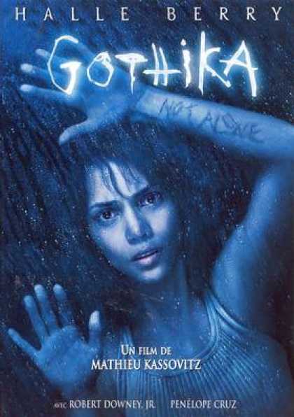
Immediately it is evident that a use of dark colours is atmospheric for this genre. The title text in all of these examples is bold and striking, using an unconventional font. There is no pattern to the images displayed on the covers, they need to correlate with the plot, but they are all visually unnerving. In other examples I have seen any shots of the characters shown on the covers will pull focus with facial expressions rather than using action shots.
All of the facial expressions shown in these examples can fill the viewer with a sense of dread, they are powerfully emotive and this will be something I need to take into account if I am to pursue horror for my final piece.

Epic/Fantasy seems to be an almost polar opposite with the techniques used on the covers.


General consensus is that action shots are used quite heavily in these covers. While the colour schemes are not dissimilar to those of Horror I would label them bleak rather than dark. Realism is used heavily in fantasy as this creates the illusion of it being real and thus enveloping the viewer,
I would call the use of striking and unusual font out as the same in both of these genres. They are both leading you into worlds and situations that are unlikely, if not impossible to happen in real life and I think a new or artistic font can portray this well.
It seems common practice to show the actors on the covers as well, unlike horror where the image just needs to give a feeling of unease, there is no need to push for that character connection.

My next step is going to be to brainstorm some film ideas, I will start with two from each genre and work towards the basic theme for each and atmospheres I would need to create for each idea with the skills I've learned.

1.Watch this Space!

Primarily I am going to be using this blog space to log my ideas and progress for the module I am currently working on.
This will become my creative haven, to be filled with brainstorms, mock-ups and instructions.
I hope to share with you the journey from idea to physical form.